Difference Between RGB and CMYK
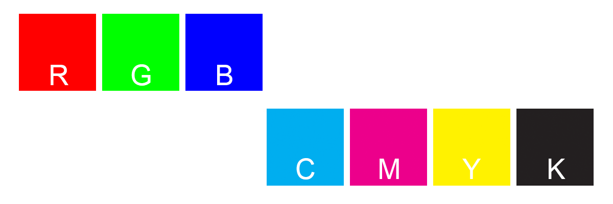
Not everyone knows the difference between RGB and CMYK color modes, especially if you’re not a graphic designer or printer. What RGB and CMYK stand for is the easy part, why it’s crucial to be aware of the difference is much more important.
RGB Color Mode
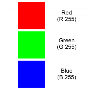
The RGB color mode is Red, Green, and Blue light added together in various ways to reproduce a broad array of colors. RGB color is mainly used for television, computer, and other electrical displays.
CMYK Color Mode

CMYK is a term used by graphic designers and printers for “full color”. The CMYK color mode is Cyan, Magenta, Yellow, and Black ink used together in printing multiple colors. K stands for “key” and is Black. Since B is already used in RGB for Blue, K for key makes sense since printing plates are carefully keyed with the Black. Some say it’s because K is also the last letter in Black.
When Do I Need RGB or CMYK?
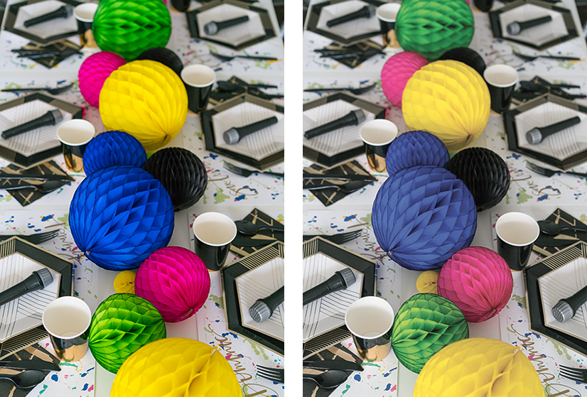
If you, or a web designer, are creating a website it will have to be in RGB color mode. The RGB color spectrum is larger than CMYK, and what you see is what you get. Keep in mind that color display configurations vary, and colors may look different on different displays. Now, where things get tricky is viewing art on your device that you intend to print. If the design is setup in RGB mode it will not be what you see is what you get when printed. See the two photos below. You will notice the RGB image on the left is more vibrant, especially the blue. The CMYK image on the right looks more washed out. If you just send the image on the left to print without making the proper adjustments, you will most like not be happy with the printed result.
Converting From RGB Mode To CMYK
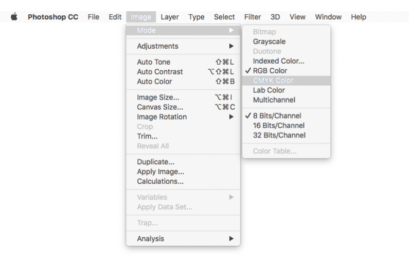
It is difficult to match the colors you see on a computer screen or mobile device to a printed product. Designing in RGB is fine, and sometimes used more often since in programs such as Adobe Photoshop you can do more with filters. You must remember though to change the color mode from RGB to CMYK before sending the job in for printing. This will also give you a chance to get more of an idea of which colors look poor and time to adjust color levels.
When viewing in CMYK mode I recommend using the eyedropper tool (seen in image below) and click on area you want to see what the CMYK color mix is (as seen in the color window on right). In this example below you can see that the Cyan is at 87, the Magenta is 73, the Yellow is 1, and the Black is 0.
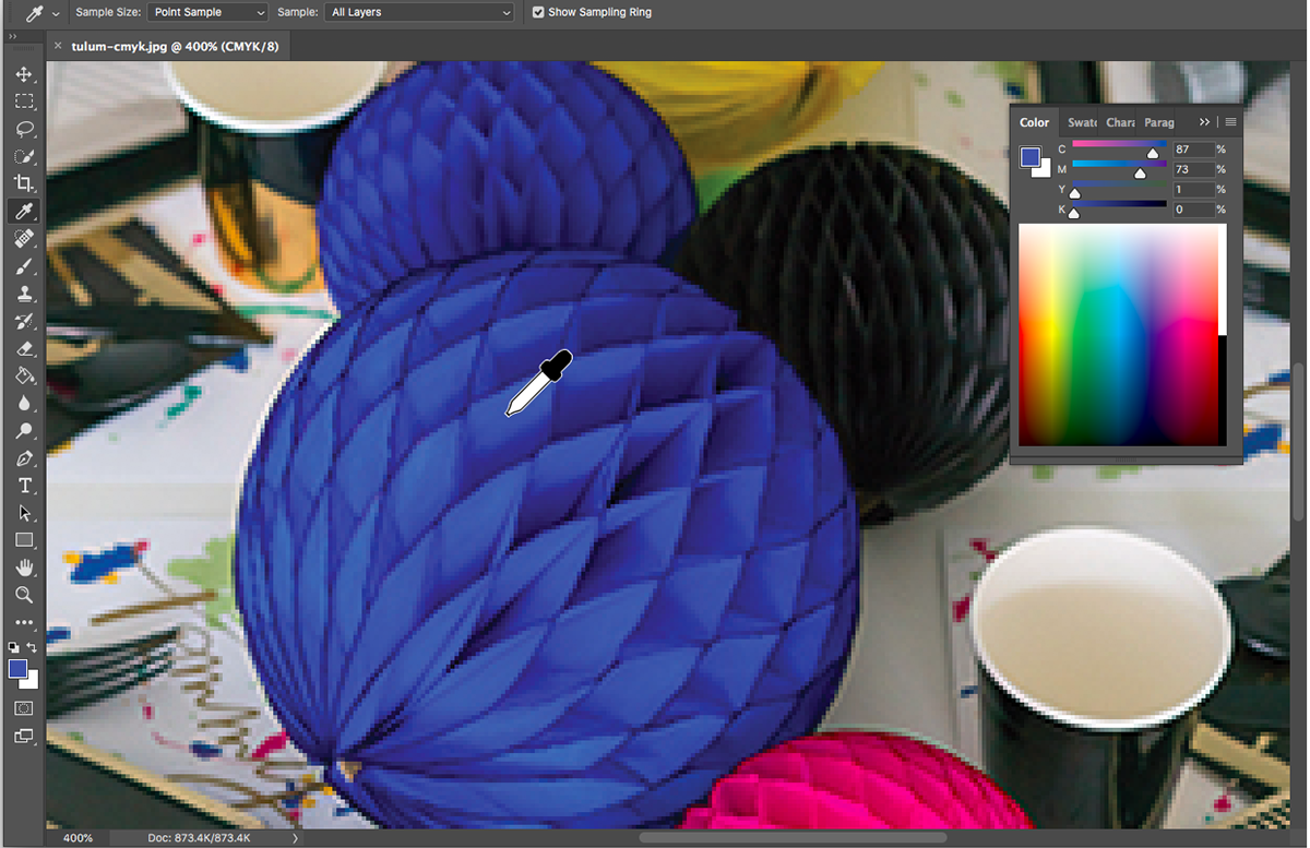
You should always look at the color mixer in Photoshop then compare those numbers to a Pantone color mixing book (image below) to get an idea of what it will print like. Most Pantone color books have the solid spot color on the left and the CMYK mix on the right. Spot color can get you more of a precise color but usually costs much more since an extra color ink is added to the printing press.

Adjusting CMYK Colors
If after matching the color with the eyedropper tool to the Pantone color book you see it’s not the color you were looking for, there are some options to fix this. In Photoshop you can go to the Image menu and then to Adjustments (image below). Here you can adjust Brightness, Contrast, Levels, Curves, Hue, Saturation, Channel Mixer, and more.

The Channel Mixer is most helpful in adjusting the Cyan, Magenta, Yellow, and Black levels. If you want to get deeper color, playing with the curves and levels are both effective. Another tip, never just use 100% K for Black. Mix some Cyan, Magenta, and Yellow to the mix to give you a much richer Black. My recommended Black mix is C 36 M 25 Y 25 K 100.
Color Mode Recap
So recapping the difference between RGB and CMYK, one is for web while the other is for print. RGB will provide you with more colors, but always print the CMYK file. Double check your CMYK numbers and try comparing them to a color chart. You should always have your logo and digital marketing material in both RGB and CMYK color modes. Save them under different file names, for web and printing.


