Islanders Fisherman Logo
With rumors that the New York Islanders may be bringing back the fisherman jersey I thought we’d analyze the design itself. Let’s just try and forget about the bad times this logo represents for a moment ( if you’re around 40 or older) and focus on just the design.
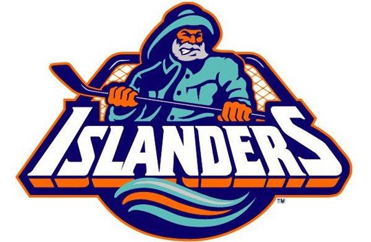
The Islanders font selection is solid and the deeper blue helps the orange pop. Not sure about the teal (it’s the 90’s we get it). Orange and blue work so well together because they are complementary colors (also the colors of NYC, Queens, and Nassau County). Adding this other color seems a bit distracting and gives the brand a more tropical feel. It’s more Montego Bay than Jones Beach.
The depth of the lettering looks great, but the one-point perspective is a bit off. It looks like the fisherman is coming out of the ground. Also, shouldn’t he be holding a goalie stick since he’s standing in front of the goal?
It’s a tough task to follow the original Islanders logo. The original has clever use of type, color and space. This is one of the best designs in all sports (original not fisherman). I put it right up there with the old Hartford Whalers logo. The designer of the fisherman logo did a great job with what he/she was given, but I still think it was rushed into production.
![]()
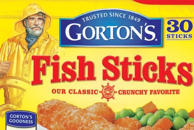
Branding and logo design go hand in hand. When developing a logo, you must research the subject that the design could resemble. The fisherman himself is very well drawn, but he looks sort of like the Gorton’s fisherman. Not exactly the brand recognition you want to go with your hockey team. “We want fish-sticks!!!”. Sorry, just had a flashback.
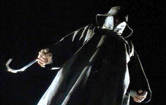
It would be great if this logo could strike a little fear into opponents. Maybe the fisherman from I Know What You Did Last Summer? This would be perfect as the third black jersey fans seem to enjoy. Ok, maybe without the hook. That’s a bit much.
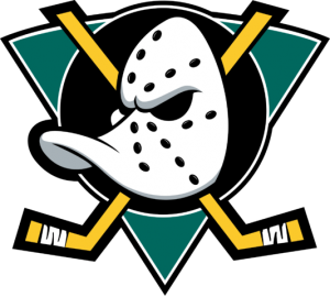
I understand the Islanders were going for that fun Mighty Ducks look. Great logo. This is the perfect example of less is more. No text equals less clutter, plus it helps being Disney and having a movie to support the branding.
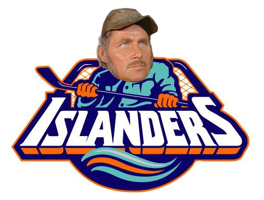
If you are going to use a fisherman, why does it have to look like he’s headed to the Grand Banks of Newfoundland? Quint from Jaws would be a better choice I think.
“Y’know the thing about a shark, he’s got… lifeless eyes, black eyes, like a doll’s eyes.”
To sum it up, the Islanders fisherman logo has some nice design aspects but most of it is so so at best. It could be fun if the team’s marketing department had a design contest for the third jersey… or just slap Billy Joel’s face on the jersey. Nothing says Long Island like Billy Joel.
My NY Islanders third jersey concept:

Show me the way to go home
I’m tired and I want to go to bed
I had a little drink about an hour ago
And it’s gone right to my head
Everywhere I roam
Over land or sea or foam
You can always hear me singing this song
Show me the way to go home